Do imports slow GDP growth?

A book published this year ‘Fully Grown: Why a Stagnant Economy Is a Sign of Success’ Dietrich Vollrath addresses the issue – is growth the best way to measure economic success — and does a slowdown indicate problems in an economy?

He discusses that the slowdown (Pre-Covid) is an indicator of economic prosperity. The economy has already provided much of what we need in life – comfort, security and luxury – that we have turned to new forms of production and consumption that enhance our well-being but do not contribute to growth in GDP. One chapter looks at the increase in imports from China and how it doesn’t necessarily have any connection with the level of GDP or growth rate. It is commonly portrayed in the media that imports from China have a negative effect on US GDP and you can say that they do impact on employment levels in certain sectors – e.g. manufacturing industry. This can lead to a slowdown in growth if workers didn’t find alternative employment. According to Vollrath the size of imports from China looks too small to account for the growth slowdown.

There is an assumption that imports lower GDP but most introductory economics courses refer to GDP with the following:

Y = C + I + G + (X-M)

Y = GDP, C = Consumption, I = Investment, G = Government spending, (X-M) = Exports – Imports
With this equation if imports are higher, it must be that GDP is lower. The right hand side of the equation is just a way of accounting for GDP; it does not determine the size of GDP. Vollrath now puts imports on the other side of the equation so you have:

Y + M = C + I + G + X

The above equation helps given the common way that people understand the relationship if they imagine that M goes up, they’ll jump to the conclusion that one of the items on the right (C + I + G + X) must have gone up as well.

Y + M is the total goods and services available in a given year which we can purchase. The other side of the equation represents the purchasing of these goods and services whether it is consumption goods, capital good, government purchases and foreign purchases. An increase in imports means that there are more goods and services to purchase. But there is no necessary mechanical effect of having more imports on the size of our own production, GDP.

GDP or GPI – Genuine Progress Indicator

HT to former colleague Kanchan Bandyopadhyay for this piece on the Genuine Progress Indicator. Most economics courses will include the topic of limitations of Gross Domestic Product as an indicator of standard of living. US senator Robert F Kennedy pointed out 50 years ago that GDP traditionally measures everything except those things that make life worthwhile.

Genuine Progress Indicator (GPI) is designed to include the well-being of a nation and it incorporates environmental and social factors which are not included in GDP. The GPI indicator takes everything the GDP uses into account, but adds other figures that represent the cost of the negative effects related to economic activity (such as the cost of crime, cost of ozone depletion and cost of resource depletion, among others). The GPI nets the positive and negative results of economic growth to examine whether or not it has benefited people overall. The figure below shows the aspects of Social, Economic and Environmental variables.

US senator Robert F Kennedy pointed out 50 years ago that GDP traditionally measures everything except those things that make life worthwhile.

The introduction of the living standards framework in New Zealand takes into account environmental resources, individual and community assets, ‘social capital’ – which includes cultural norms and how people interact – and human capital, such as people’s health, and their skills and qualifications.

By living standards, the NZ Treasury means more than income; it’s people having greater opportunities, capabilities and incentives to live a life that they value, and that they face fewer obstacles to achieving their goals.

Limitations of GDP as a measure of standard of living – see list below.

  1. Regional Variations in income and spending
  2. Inequalities of income and wealth
  3. Leisure and working hours
  4. The balance between consumption and investment
  5. The shadow economy and non-monetised sectors
  6. Changes in life expectancy
  7. Innovation and the development of new products
  8. Defensive expenditures

Scandinavian countries most expensive but happy

Another good video here with Tom Chitty from CNBC – outlines why the cost of living is so high in Scandinavia – Norway, Sweden and Denmark. These countries on average have some of the highest tax rates (see graph) in order to fund a large welfare state. Expenditure in social welfare is one of the highest as a % of GDP and eventhough it is very expensive to live in these countries they rank as some of the happiest.

A Level Revision: Comparing living standards over time and between countries

National income figures, usually GDP at factor cost, are the man figures used to compare living standards. This is because most countries keep and publish detailed national income data.

However, care has to be taken in using national income figures to compare living standards both over time and between countries. It is important to use GDP at constant prices (i.e. real national income) so that a misleading impression is not given because of the effects of inflation. It is also important to take into account differences in population size. A country with a large population is likely to produce more than a country with a small population. However, this output has to be shared out among more people so living standards are not necessarily higher. This is why economist divide output by population and compare real GDP per capita. Even when adjustments have been made for inflation and differences in population size, national income figures as a measure of living standards have to be interpreted cautiously.

A rise in real GDP per capital may have resulted from an increase in the output of capital goods. In the longer run this will increase productive capacity and result in more consumer goods being produced. However, in the short run people may not feel any benefit from more capital goods being made. An increase in weapons will also increase GDP but, again, may not necessarily improve living standards. If more police are employed and crime is reduced, the quality of people’s lives will be improved. However, if more police are employed to keep pace with rising crime, people will be feeling worse off. So economists have to look not only at the amount of goods and services produced but also at the composition of those goods and why the quantity has changed. In addition, the quality of goods and services produced should be examined. The same quantity could be produced this year as last year or five years ago but if the quality of the output has risen, living standards will have improved.

The distribution of income also has to be taken into account. National income may rise but if it is concentrated in the hands of a few, the living standards of the majority may not rise. See graph below from The Economist showing the Gini coefficient of income inequality.

Gini Coef Nordic

National income figures also fail to take into account some items which affect the quality of people’s lives. A certain amount of economic activity is not declared, either to avoid paying taxes or because it is illegal. If there is an increase in, say, people providing home hairdressing services but not declaring them, people’s living standards may rise, although this increase will not be reflected in the official figures.

Differences in working hours and working conditions are also not taken into account. If output remains constant but working hours fall, people are likely to have a higher quality of life.

National income figures only take into account economic activities for which a payment is made. They do not take into account externalities and non-marketed activities. So, for example, an increase in pollution will reduce living standards while an increase in people decorating the homes of old people, on a voluntary basis, will improve the quality of life of the elderly. Neither of these will be recorded in national income figures.

All of these factors have to be taken into account in using national income figures to make comparisons both over time and between countries. However, some additional factors have to be considered when making international comparisons. Different statistical methods are employed in some countries and the degree of accuracy can vary. Tastes and needs can be different in different countries. For example, people living in a cold climate have to spend more on heating than those in warm countries, merely to enjoy the same standard of living. There is also the problem of selecting a rate of exchange to make the comparison. Exchange rate fluctuate and do not always reflect relative prices in compared using purchasing power parities which compare the cost of a given basket of goods in different countries.

High Inequality = High Unemployment

The US economy has had the highest sustained level of unemployment since the Great Depression of the 1930’s. One reason for this has been the significant increase in income inequality as there is a redistribution of income from low income families to high income families. When you consider the proportion of income that is spent by both groups you will find that the lower income groups consume a much greater percentage of the their income than their higher income counterparts. Therefore we take more consumption out of the economy with slower growth and ultimately a loss of jobs = higher unemployment. Here is a clip from Paul Solman of PBS.

A2 Revision – Nominal GDP per capita v PPP per capita

Our material well-being
• The standard of living is simply a measure of the economic or material welfare of the inhabitants of a country, a region or a local area.
• The baseline measure is real national output per head of population.
• Real income per capita is an inaccurate and insufficient indicator of living standards

Per Capita National Incomes
National income data can be used to make cross-country comparisons. This requires:

1. Converting GDP data into a common currency (normally the dollar or the Euro)
2. Making an adjustment to reflect differences in the average cost of goods and services in each country to produce data expressed at a ‘purchasing power parity’ standard

Data on per capita income based on a country’s total personal income are rarely available. Thus, the Gross domestic product (GDP) is more commonly used. However, the total personal income is generally lower than the gross domestic income.

A list of the top ten countries, and the lowest-ranking country, by GDP per capita (in terms of purchasing power parity – PPP – and nominal values) for the year 2010

PPP Parity

Problems of accuracy:
Officially data on a nation’s GDP tends to understate the true growth of real national income per capita over time e.g. due to the expansion of the shadow economy and the value of unpaid work done by millions of volunteers and people caring for their family members. There may also be errors in calculating the cost of living

The scale of the informal “shadow economy” varies widely across countries at different stages of development. According to the IMF, in developing countries it may be as high as 40% of GDP; in transition countries of central and Eastern Europe it may be up to 30% of GDP and in the leading industrialised countries of the OECD, the shadow economy may be in the region of 15% of GDP

Spain hold onto Euro

Having arrived in Spain (Mallorca) last night just before the euro final I could not post something about football – the Spanish know how to celebrate. Spain showed their class and are an exceptional team to have won three major tournaments in the last four years. Some have likened them to the Brazil team of 1970.

In keeping with Spanish football, I came across Simon Kuper, co-author of Soccernomics, on the eZonomics website by ING. One particular part of the site focuses on soccer – Cup-o-nomics – in which current issues in the sport are related to economics. With the Euro 2012 Championship on he has written several articles about players. managers etc.

In July 2007, the Spanish striker Fernando Torres moved from Athletico Madrid to Liverpool. Torres commanded a salary of £90,000 (NZ$175,500) a week at Liverpool, equivalent to £4.6m (NZ$9.1m) a year. Interestingly enough this was a salary cut as at Athletico he was on an annual salary of €8 million (about NZ$10.5 million). However within a year of signing for Liverpool the purchasing power of his income decreased for the following reasons:

1. The pound depreciated against the euro (hard to believe now) by around 20%. Most foreign players tend to send home a lot of their salary and therefore Torres needed to use more pounds to buy euros.
2. After 2008 and the financial crisis the UK experienced over 5% inflation which again would have lessened the purchasing poser of his income. Most soccer players are on a given salary for the duration of their contract and therefore don’t have their income indexed to the CPI or cost of living.

Even all this said, Fernando Torres is probably not too worried about exchange rate fluctuations or inflation rates when you look at his salary and the season he has just had with Chelsea and Spain.

McKinsey’s Economic Centre of Gravity – Round Trip

You may remember the post I did on the economic centre of gravity (ECG) by LSE’s Danny Quah. By economic centre of gravity he refers to the average location of the planet’s economic activity measured by GDP generated across nearly 700 identifiable locations on the Earth’s surface. Recently the McKinsey Global Institute showed how the economic centre of gravity – the geographic center of the world’s annual economic growth – has moved since AD 1 to a forecast year of 2025 – at a speed of 140kms per year.

Timeline:

1. Until 1700 China and India were about 60% of world GDP
2. British and American Revolutions which led to mass urbanisation and productivity gains ECG moved West
3. 1980’s-90’s it gravitates back to the East with the expansion of Japan and other asian economies. This is even with the Asian Crisis in 2000.
4. 2000 – 2010 sees a massive shift to the east with the impact of the Financial Crisis plus the continued growth of developing nations in the east.

McKinsey put the growth down the speed at which cities are growing especially in India and China. This has ultimately given rise to productivity and a growing consumer class. Much of this future growth (approximately 47%) will be driven by 440 developing world cities.

A different resource curse

Nigeria, the eleventh largest producer and the eighth largest exporter of crude oil in the world, typically produces over 2.4 million barrels per day (b/d) of oil and natural gas liquids. However, according to the IMF, while the Nigerian economy has benefited $800 billion dollars in oil revenue since 1960, this has added basically nothing the Nigerian economy or the standard of living of the average Nigerian. In fact the World Bank estimates that since 1960 $100 billion of the $800 billion in oil revenues have gone missing.


For most economies that have natural endowments like oil or minerals, there is the risk of the economy experiencing the ‘resource curse’. This is when a natural resource begins to run out, or if there is a downturn in price, manufacturing industries that used to be competitive find it extremely difficult to return to an environment of profitability. According to Paul Collier, Nigeria has a resource curse of its own, the civil war trapin which 73% of the low income population have been affected by it, as well as a natural resource trap- where the so-called advantages of a commodity in monetary value did not eventuate – on average affecting only 30% of the low income population. It seems that in Nigeria there is a strong relationship between resource wealth and poor economic performance, poor governance and the prospect of civil conflicts. The comparative advantage of oil wealth in fact turns out to be a curse. governments and insurgent groups that determines the risk of conflict, not the ethnic or religious diversity. Others see oil as a “resource curse” due to the fact that it reduces the desire for democracy. You can read the full version of this article by going to the econoMAX website below:

econoMAX

TED Talk – Inequality by ‘Spirit Level’ author

Here is a TED Talk by Richard Wilkinson who is the co-author of “The Spirit Level – Why More Equal Societies Almost Always Do Better”. The books focuses on how inequality in a country is conducive to unhealthier, unhappier, greater obesity, higher crime rates etc. However critics have said it lacks substantive data – can we say that because New Zealand has a bigger income gap than Greece that it has greater social problems? Richard Wilkinson goes through a lot of the graphs and data that he mentions in the book.

Tour of the US income distribution – “The L Curve”

Here is a great animated graphic that I got from a comment on the posting entitled “Distribution of Income – USA”.

The red line represents a graph of family income across the population. The height of the curve at any point is the height of a stack of $100 bills equalling that income.

– The family at the 50th percentile, the 50-yard line of the football field, has an income of $40,000 (A stack of $100 bills 4cm tall)
– The family on the 95 yard line earns about $100,000 per year, a stack of $100 bills about 10cm high.
– At the 99 yard line the income is about $300,000, a stack of $100 bills about 30cm high.
– The curve reaches $1 million (a 101cm high stack of $100 bills) one foot from the goal line.
– From there it keeps going up and at 50 kilometers, the pile of $100 bills extends beyond the stratosphere, more than 5 times the height of Mt. Everest.

Here is the link – just keep clicking Zoom Out on the site The L-Curve

Distribution of Income – USA

From the New York Times – Economix column – The US Tax Policy Centre has updated its figures on the income distribution in America, which showed why most rich people don’t feel very rich. They have now crunched income levels for every single percentile, and the numbers refer to 2011 rather than 2010.

Incomes grow much, much faster at the top end of the income distribution than in the middle or at the bottom end. That is, the disparity in income between one percentile and a consecutive percentile is bigger among the very rich. In fact much of the rise in inequality over the last few decades has been because of the increasing inequality isolated among the very top members of the income distribution, as America’s wealthiest have pulled further and further away from their slightly less wealthy peers – see data and graph below.

Differences:
50th and 51st percentile is $42,327 versus $43,564 = $1,237
98th and 99th percentile is $360,435 versus $506,553 = $146,118
99.5th and 99.9th percentile is $815,868 versus 2,075,574 = $1,259,706

The Economics of Salvation

A hat tip to colleague David Parr for this piece on the Economics of Salvation. David was awarded the Margaret Myers Teaching Fellowship in 2011 and has just returned from studying the history of Renaissance art in the very city in which it had been created – Florence. On his blog entry for Thursday 5th May he discusses the Economics of Salvation. Here is a piece from it.

Then today I came across a wonderful term, the Economics of Salvation. It was used in connection with a discussion by Dale Kent regarding the obligation of charity observed by wealthy citizens in Renaissance Florence in an essay, The Brancacci Chapel Viewed in the Context of Florence’s Culture of Artistic Patronage. Professor Kent identifies the unusual prevalence throughout the fresco cycle of widows, orphans, cripples and the poor amongst those wealthier citizens of the San Frediano district painted by Masaccio and Masolino in the Brancacci Chapel. As the chapel is in the church of Santa Maria del Carmine pictured above, here was an unexpected fusion of art and real life.

In this detail of the Healing of the Cripple by Masolino, the extended gestures of St Peter’s and the cripple’s empty palms are dramatic focal points of the narrative. Two well-dressed young men stroll through the piazza chatting, as in the distance, a wealthy man enters his palazzo having passed an orphaned child and a widow on the street, pointing up the social differences…

WECG – World’s Economic Centre of Gravity

Danny Quah of the London School of Economics (LSE) recently wrote a paper describing the dynamics of the global economy’s centre of gravity. By economic centre of gravity he refers to the average location of the planet’s economic activity measured by GDP generated across nearly 700 identifiable locations on the Earth’s surface.

In 1980 the WECG was located at a point in the middle of the Atlantic Ocean but by 2008 it had drifted to a location at about the same longitude as Izmir and Minsk, and thus east of Helsinki and Bucharest. Extrapolating growth in the 700 locations is projected by 2050 to locate between India and China. The graphic below shows, in 3 year intervals, the WECG 1980-2007 in black and projections for 2010 – 2049 in red. It is interesting to note how the WECG seems to move horizontally so does this suggest that the north-south divide will remain invariant? In looking at the actual data in Quah’s research, it shows that latitude declines from 66 degrees North to 44 degrees North by 2049. This might seem to imply that the south, like the east, is actually gaining considerable relative economic strength. If you are interested in Quah’s paper you can download it by clicking here.

The Inequality Weather Forecast

Thanks to Geoff Riley of the Tutor2u blog for this amusing clip of the inequality weather forecast. In earlier posts I mentioned the book that the clip is advertising – “The Spirit Level”. The book shows that there are a significant negative effects of the increase in inequality in an economy. Many graphs are presented which show how certain variables are influenced by the level of inequality. Here are some of their conclusions . Inequality:
*causes shorter, unhealthier and unhappier lives;
*increases the rate of teenage pregnancy, violence, obesity, imprisonment and addiction

On almost every index of quality of life, or wellness, or deprivation, there is a gradient showing a strong correlation between a country’s level of economic inequality and its social outcomes. Almost always, Japan and the Scandinavian countries are at the favourable “low” end, and almost always, the UK, the US and Portugal are at the unfavourable “high” end, with Canada, Australasia and continental European countries in between.

If Britain were instead to concentrate on making its citizens’ incomes as equal as those of people in Japan and Scandinavia, we could each have seven extra weeks’ holiday a year, we would be thinner, we would each live a year or so longer, and we’d trust each other more. Guardian Newspaper

England’s North South ‘Health’ Divide

There are some interesting statistics from a recent study out of the UK regarding the health of those in the North and South of England.
* 37,000 people in the north die earlier than their counterparts in the south
* deaths in the north before the age of 75 are 20% higher than the south
* gross value added per head (a measure of the state of the local economy) was 40% higher in the south

It seems that social and economic factors are extremely reliable predictors of health.
* Disposable income in the south is 26% higher.
* £19,038 in London and £16,792 in south-east. By contrast disposable income in the north east is £12,543
* Parts of the north have unemployment of 14.1% and on average is much higher than that of their southern counterparts.
* House prices on average increased by 6.3% in the south but experienced 3.3% fall in the north.
The ultimate reason for the gap is disposable income.

World Income Inequality chart

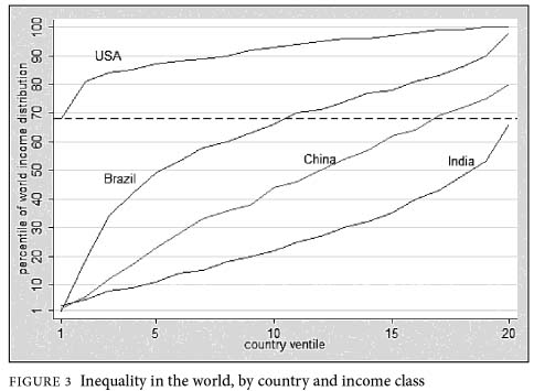
Still on the inequality theme – here is a very worthwhile chart that looks at World Income Inequality. It is from the publication entitled “The Haves and the Have-Nots,” a new book by the World Bank economist Branko Milanovic about inequality around the world which was recently reviewed by New York Times columnist Catherine Rampbell. The graph below shows how inequality in Brazil, USA, China, and India ranks on a global scale. On the x axis the population of each country is divided into 20 equally-sized income groups, which is ranked by each country’s household income per person. These are referred to as ventiles and 1 ventile = 5% of the population. So that we are looking at purchasing power parity (PPP) the data is adjusted for the variance in the cost of living in different countries.

Now on the vertical axis, you can see where any given ventile from any country falls when compared to the entire population of the world.

Brazil
– poorest 5% are amongst the poorest in the world
– richest 5% are amongst the richest in the world

USA
– the bottom 5% are richer than 68% of the world’s population

India
– the bottom 5% = 4th poorest percentile worlwide.
– the richest 5% = 68th percentile worldwide which means that USA’s poorest = India’s richest.

Now you might be wondering: How can there be so many people in the world who make less than America’s poorest, many of whom make nothing each year? Remember that were looking at the entire bottom chunk of Americans, some of whom make as much as $6,700; that may be extremely poor by American standards, but that amounts to a relatively good standard of living in India, where about a quarter of the population lives on $1 a day.

Growth – a means or an end?

The United Nations measure the development of countries using the Human Development Index. As you maybe aware this consists of three variables:
1. per-capita income,
2. life expectancy and
3. literacy rates.

This index is then used to rank countries by how “developed” they are – 169 countries were ranked in 2010. Below is the top and bottom country.
1. Norway
169. Zimbabwe

The latest Human Development Report identified that in particularly less developed countries there is a poor correlation between economic growth and improvements in health and education The graph below shows that where income has increased the impact on non-income variables (literacy and life expectancy) has been minimal. Source: New York Times – Relationship between economic growth and the non-income components of the Human Development Index, 1970–2010.

Here’s one example (from the New York Times) of economic growth not translating to development as expected.

Take a revealing comparison between China — the world’s fastest growing economy in the past 30 years — and Tunisia. In 1970 a baby girl born in Tunisia could expect to live 55 years; one born in China, 63 years. Since then, China’s per capita GDP has grown at a breakneck pace of 8 percent annually, while Tunisia’s has grown at 3 percent. But a girl born today in Tunisia can expect to live 76 years, a year longer than a girl born in China. And while only 52 percent of Tunisian children were enrolled in school in 1970, today’s gross enrollment ratio is 78 percent, considerably higher than China’s 68 percent.

It seems that there is little correlation between improvements in national income and improvements in education and health.

Economic Freedom – New Zealand 3rd

A report from the Economic Freedom of the World (EFW) measured the degree to which the policies and institutions of countries are supportive of economic freedom. Forty-two data points are used to construct a summary index and to measure the degree of economic freedom in five broad areas:

1 Size of Government: Expenditures, Taxes, and Enterprises;
2 Legal Structure and Security of Property Rights;
3 Access to Sound Money;
4 Freedom to Trade Internationally;
5 Regulation of Credit, Labour, and Business.

The research shows that individuals living in countries with high levels of economic freedom enjoy higher levels of satisfaction, greater individual freedoms, higher GDP per capita and a greater life expectancy. Below are the top and bottom 10 countries in the research (10 = perfect freedom)