Currency Problems in Fragile Five

Morgan Stanley has recently coined the term the ‘Fragile Five’ which alludes to those troubled emerging market currencies of Brazil, South Africa, India, Turkey and Indonesia. Not only have their currencies been of concern but also rising inflation, weak growth and sizeable current account deficits.

Why the currency problem in emerging markets?

In the latter part of 2013 the then US Federal Reserve Chairman Ben Bernanke signaled that there would be a scaling back or ‘tapering off’ of its quantitative easing programme. Beginning in January 2014, the Fed would buy $75 billion in bonds each month, down from the $85 billion it had been buying since September 2012. Over the last couple of years QE has kept interest rates low forcing investors to look further afield to seek out the best return. Emerging markets attracted a lot of this capital and this had the effect of appreciating the local currency. With the tapering of bond purchases by the Fed and the improvement in the US economy, interest rates will begin to rise again which will attract capital back into the US and out of emerging markets. This is predictable but will the extent of this outflow of capital intensify into an emerging market currency crisis?

Fragile 5

The central banks of Brazil, India, Indonesia, South Africa and Turkey have been busy hiking rates to counter plunging currencies. But currency depreciation has been a policy that many countries have pursued to boost growth in their economies – the weaker currency makes imports more expensive and exports cheaper. However the higher inflation that is generated by a weaker currency will diminish competitiveness sooner or later again.

______________________________________________________________________________

The above is a brief extract from an article published in this month’s econoMAX – click below to subscribe to econoMAX the online magazine of Tutor2u. Each month there are 8 articles of around 600 words on current economic issues.

econoMAX

Global Financial Instability Flow Chart

Below is a flow chart that shows some of the causes of financial instability in the global economy. Below are the the main points:

* The mismatch in the banking system with regards to paying debt
* Low interest rates and lack collateral required means more lending
* Good debt – productive use in capital investment (however very limited in most countries)
* Bad debt – non-productive assets used for speculation purposes (popular with investors)
* Capital Flows – Governments can fund current a/c deficits with borrowing from overseas
* From this further increases in the supply of money and therefore lending.
* Ends with a property bubble.

Financial Instability

US Job Growth – Manufacturing is not the answer

For the most of 2013 and in his State of the Union address this year, President Obama has supported the idea that investment in the manufacturing sector is a part of the solution to the high unemployment figures in the US. This type of thinking might have worked in the 1950s when employment in a factory was reasonably accessible but it doesn’t account for the changes to the US and global economy.
Historical figures (see table below) show that although there has been an increase in the value of output in the manufacturing sector the goods have been produced by fewer employees with the numbers falling from 19 million in 1980 to 12 million in 2012.

US Manufacturing history

The employment growth has been in the service sector with a third of the total providing services to the manufacturing sector. It is thought that over 50% of the work in the manufacturing sector is services- based e.g. management, sales, support etc. As is obvious with most manufacturing industries, companies have spent more on technology and have been looking to replace labour with machines. As a result of more capital, output per worker in the whole economy increased by 85% between 1980 and 2012. However within manufacturing this increase in productivity amounted to 189%.

If manufacturing is going to generate more jobs there needs to be a greater focus on retraining workers, improvements in infrastructure and agreements that encourage foreign direct investment. Nevertheless are these reforms worthwhile as the manufacturing industry makes up for only 10% of US GDP and employs 10% of the labour force? Would the service sector be a better option?
__________________________________________________

The above is a brief extract from an article published in this month’s econoMAX – click below to subscribe to econoMAX the online magazine of Tutor2u. Each month there are 8 articles of around 600 words on current economic issues.

econoMAX

BIS Global Turnover and Currency Pairs

Every three years since 1989 the Bank for International Settlements (BIS) produces a survey which is acknowledged as the most informative on the size and structure of the global foreign exchange markets. It relies on global Central Banks to collect data from their own banking system which totals approximately 1,300 banks and it is then collated by BIS.
Global Turnover and Currency Pairs

Since the last survey in 2010, FX market activity per day has increased from US4$ trillion to US$5.3 trillion in 2013. The growth in global turnover figures are telling when you go back to 2003 – figures at current exchange rates:

2003 – 2007 – 72% increase
2007 – 2010 – 19% increase
2010 – 2013 – 35% increase

Although they are percentage figures it is not surprising that between 2003 and 2007 there was a significant increase in economic activity especially in the US$ which is the most traded currency. The Global Financial Crisis followed this period and subsequently the percentage increase dropped below the 35% average that has been evident in past triennial surveys. The recent increase does signify a recovery of sorts and a return to the norm.

Within the last three years the make-up of global FX trading has changed with the trading activity of the Japanese Yen increasing markedly as well as currencies in emerging markets namely the Mexican peso and the Chinese renminbi. However the US dollar remains unchallenged as the dominant currency on the global economy – foreign exchange deals with the US$ on one side of the transaction represented 87% of all deals. (Remember because there are two sides to each transaction so total trades add up to 200%). In the USD/JPY pair there was a significant increase in activity (70% from last survey) and at 18.3% they are closing in on the lead pair USD/ EUR that stands at 24.1% see graph. This is one of the reasons for the increase in the Yen to 23% of Global FX.

Although the Euro is the second most important currency its role has diminished with the debt crisis in Europe. Since 2010 it has lost 6% of the Global FX market and now stands at 33.4% the lowest value since the introduction of the common currency in 2002. Furthermore in currency pairs it has increased much less than its USD equivalent, which dominates the top ten pairings.

With the relatively high interest rates over the last three years the Australian and New Zealand dollars have sustained their increase in global FX trading. The Reserve Bank of Australia has had its cash rate at very high levels – 4.75% from 3rd November 2010 to 2nd November 2011, which has attracted ‘hot money’. However the presence of the Canadian dollar, the Swedish krona and the Swiss franc has decreased in activity.

Turnover by currency pairs

__________________________________________________

The above is a brief extract from an article published in this month’s econoMAX – click below to subscribe to econoMAX the online magazine of Tutor2u. Each month there are 8 articles of around 600 words on current economic issues.

econoMAX

Why are people risk adverse?

RiskOne of the major concerns with regard to economic growth, especially in the US, the is lack of risk taking i.e. Entrepreneurial decision-making, self-employment etc. Ultimately risk-taking is the fulcrum of the economic cycle of booms and slumps which John Maynard Keynes referred to Animal Spirits. However research in Behavioural Economics has shown that there is a reason for this behaviour. A recent Free Exchange article in The Economist discussed this area.

A simple test that has been carried out is as follows. Would you prefer:

1. A gift of $50, or
2. To play a game with a 50% chance of winning $120

It might seem logical to chose the second option since the average return in $60. However most people chose the more secure option rather than take the risk. But risks do vary according to the individual and the time period.

Individual as risk taker

The following are seen as influences in risk behaviour:
1. Education – more educated likely to take risks
2. Income – the higher the income the more likely to take risks
3. Gender – Men more likely to take risks

Historically

Research shows that those people who experienced high returns on the stockmarket in their early years were likely to tolerate more risk to own shares as a higher proportion of their income. However a bad experience can dampen risk-taking and this would be prevalent today with the impact of the GFC. Also after the Wall Street crash of 1929 the US economy came to standstill as people were very tentative of taking any risks after what they had been through.

It is not just a financial crisis which affects risk-taking. The tsunami that hit South-East Asia in 2004 and Japan in 2011 can put an end to risk-taking as people rebuild their lives. Furthermore military conflicts such as the Korean war can cause their victims more cautious for long periods of time.

Horror Story = Risk Aversion

One group of universtiy students watched a horror story which contained a gruesome torture scene whilst another group didn’t. On completition of the horror scene both were asked some questions about their propensity for risk. Students who had seen the horror story reported increased aversion to risk by roughly the same amount that the GFC had on people. With this in mind the GFC in likely to restrict consumers from taking the sort of risks that help propel the economy for decades to come. It could be that the lack of entrepreneurial spirit will hinder growth and governments rather than worry about debt will have a lack of risk-takers to deal with.

Economic Systems: France v Germany

Here is a useful video on economic systems from the BBC – CIE AS course Unit 1. France’s economy has struggled in recent years and President Hollande has plans to reduce the levels of bureaucracy and the size of the state sector – moving to less government intervention.

Critics say France has too centralised and big a state sector. By contrast, in Germany much of the decision making is at local level.

So how do the two systems compare?

OECD GDP per capita figures – 2012

Here are Gross domestic product per capita figures for the 34 member countries of the OECD (Organisation for Economic Co-Operation and Development) for the 2012 calendar year on a purchasing power parity (PPP) basis. Purchasing power parity (PPP) is when an amount of money in one country can be exchanged for a quantity of foreign currency, and the two amounts will buy identical baskets of products in both countries – see recent post on the Big Mac Index.

The OECD is a group of countries that share a commitment to democratic government and the market economy. New Zealand has been a member of the OECD since May 1973. Currently, there are 34 member countries, with four new members joining in 2010. These included Chile, Slovenia, Israel, and Estonia.

OECD - GDP per capita 2012

Emerging Markets take hit as Fed starts the tapering process

Recent volatility in the major financial markets has had ripple effects on the emerging economies especially the fragile five – Turkey, India, Brazil, South Africa, and Indonesia.

The emerging markets are currently facing 4 major concerns:

1. The Chinese economy’s growth rates are slowing – China is a very important trading partner for many emerging markets.

2. There is the prospect of monetary tightening in the US which could increase interest rates. This then leaves investors a dilemma. Do they continue to invest in emerging markets with volatile growth prospects or take the now safer option by investing in U.S. Treasury bills which are perceived to have no default risk.

3. All these economies have significant current a/c deficits which means that they rely on overseas funding to pay for domestic consumption and investment.

4. Politically they are unstable which makes the implementation of reforms near impossible.

It is important to remember that before the tapering of QE purchases liquidity in developed countries has gravitated towards higher returns in emerging markets and the carry trade. Since the start of the tapering process the volume of money into emerging markets has fallen which means that they will have to tighten up their own budget policies or reduce investment and domestic consumption.

Individual Concerns:

Turkey – political problems – current account deficit – exchange rate depreciation.

Argentina – political problems – high Inflation – exchange rate depreciation (Peso has fallen 14% since 22nd January).

India – very high inflation = higher interest rates = reduced domestic consumption

Brazil – similar to India – very high inflation = higher interest rates = reduced domestic consumption

Indonesia – current account deficit – slow growth – budget problems with US tapering.

Below is a graph from The Economist showing emerging market currencies depreciating over the last 9 months as investors move their money elsewhere.
Emerging Markets v US$

US healthcare costs

Many thanks to David Parr for this video clip. John Green (John Green is an American author of young adult fiction and a YouTube video blogger) discusses the complicated reasons why the US spends more on health care than any other country in the world, and along the way reveals some surprising information, including that Americans spend more of their tax dollars on public health care than people in Canada, the UK, Australia or New Zealand. Who’s at fault? Insurance companies? Drug companies? Malpractice lawyers? Hospitals? Or is it more complicated than a simple blame game? He does mention inelastic demand for healthcare for obvious reasons.
Healthcare Costs US

To Taper or not to Taper – that is the question

The US Federal Reserve announced on 18th December a tapering of its bond-buying program to $75bn a month beginning in January. This video from Paul Solman of PBS is a useful guide about the process and asks economists (including Robert Shiller) their opinion on the matter. Recently the Fed said that it would lower its monthly long-term Treasury bond purchases to $40 billion and mortgage-backed securities to $35 billion a month.

Global Inequality

Some interesting facts in this video regarding global inequality. Particularly useful if you are covering the Lorenz Curve – notice the shape in the video. The richest 300 people in the world have the same wealth as the poorest 3 billion. The world is more unequal than at any time in history – 200 years ago everyone was poor. A small number of countries have achieved economic growth and been able to create jobs and raise the standard of living. However those countries represent only about 15% of the global population whilst 85% is what we call the developing world.

Emerging Economies need to follow Taylor Rule.

The Taylor rule is a “monetary-policy rule that stipulates how much the central bank should change the nominal interest rate in response to changes in inflation, output, or other economic conditions.” It is named after Stanford economist John B. Taylor. Source: Wikipedia

The Credit Writedowns site had an interesting article stating that interest rates in emerging markets were far too low and were well below the rate outlined in the Taylor Rule. According to the Taylor rule, for each 1% increase in inflation, a central bank should raise the nominal interest rate by more than 1%. While the Federal Reserve never operated according to a strict Taylor rule, many thought of it as a guideline which did influence Fed thinking. But in the wake of the financial crisis, no one is paying any attention to the Taylor Rule. They mention a report by the World Bank which addresses the issue of monetary policy in emerging markets.


The “imported” easing of monetary conditions through large capital inflows in recent years has contributed to rapid credit expansion, widening current account deficits, and increasing banking sector vulnerabilities in some cases.

The surge of capital flows in the post-crisis period has contributed to lenient domestic credit conditions, directly through cross-border intermediation channels and indirectly through exchange rate and monetary policy spillovers. Regarding the latter, a simple Taylor Rule predicting the monetary policy stance of central banks in developing countries on the basis of domestic conditions (deviation of consumer price inflation from the policy target and the level of slack in the economy) suggests that policy rates were kept lower than normally suggested during periods of large capital inflows (figure B3.7.1 and He & McCauley (2013))
Taylor Rule

“Beware the Ides of March” – RBNZ

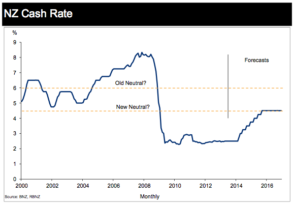
Although the Ides of March refer to the 15th March, the next Monetary Policy Statement from the Reserve Bank Governor is on the 13th March and most commentators believe that this will be the first of many hikes that will see the OCR hit 4.5% by late 2015. There was a belief that RBNZ Governor Graeme Wheeler would start hiking last week but central banks don’t like giving exact dates. But the Christchurch rebuild and the increase in Auckland house prices will warrant higher costs of borrowing

Central Banks have often used the term ‘the neutral rate’ which refers to a rate of interest that neither stimulates the economy nor restrains economic growth. This rate is often defined as the rate which is consistent with full employment, trend growth, and stable prices – an economy where neither expansionary nor contractionary measures need to be implemented. In most economies post GFC the neutral rate of interest fell as they have required lower rates to try and encourage growth. The graph from the BNZ below shows that the neutral rate in NZ has dropped form 6% to 4.5%.

OCR Forecasts

Is investment in manufacturing the right choice for the US economy?

For the most of 2013 and in his State of the Union address this year, President Obama has supported the idea that investment in the manufacturing sector is a part of the solution to the high unemployment figures in the US. This type of thinking might have worked in the 1950’s when employment in a factory was reasonably accessible but it doesn’t account for the changes to the US and global economy.

The first graph below shows the % of manufacturing that makes up US GDP. Would it be better to focus on services? Do the US have a comparative advantage in manufacturing anymore? Investment in manufacturing does not actually create the jobs that it once did. Would it therefore be better to focus on the service sector industry (education and medical +12.2%) as that has been the growing sector from 2008 to 2013 whilst manufacturing has been in significant decline -12.5% see second graph below.

Manuf % GDP
US Changes in jobs