Below is a graphic from the ANZ looking at supply and demand for labour and the unemployment rate in New Zealand.
Points to note about recent figures:
Labour force grew by 4000 – immigration up.
Economy lost 6000 jobs.
Greater number of looking for fewer jobs
Unemployed labour force risen from estimated 10,000 to 134,000 divided by 3.07 million in the labour force. 134,000 ÷ 3,070,000 x 100 = unemployment of 4.3%.
Not the usual cyclical unemployment
Youth unemployment highest level since 2015
Unemployment for those over 25 still below pre-Covid levels
Since the border has reopened (2022) employment of teenagers has fallen as migrants have filled jobs.
Sign up to elearneconomics for comprehensive key notes with coloured illustrations, flash cards, written answers and multiple-choice tests on Unemployment that provides for users with different learning styles working at their own pace (anywhere at any time).
By trying to restrict investments in oil and gas ventures, is the ESG movement going to have the effect of reducing supply of oil as global demand increases? With this scenario the price of energy will increase and developing countries will find it even more difficult to provide its citizens with electricity, water etc which requires energy in the form of oil, gas and to some extent coal. Developing countries will need significant financial help from the developed world if they are going to grow in a sustainable and environmentally favourable way. The concern is the reliance on oil and gas and the ever increasing demand – see graph:
Environmental, social, and governance (ESG) investing is used to screen investments based on corporate policies and to encourage companies to act responsibly. There has been a lot of anti ESP feeling as a focus on environmental and social issues conflicts with the corporate duty of maximising the return for shareholders. Banks in particular have indicated that they may withdraw from corporate alliances that have promised to cut carbon emissions across entire industries. Oil companies are following suit as both Shell and BP, after years of headline-grabbing management changes, splashy deals and ambitious attempts to woo ESG investors with forays into low carbon businesses, have promised to focus on their core business and return as much cash as they can to shareholders – see video from the FT below. But as Gillian Tett points out:
The challenges around sustainability and business are not going to disappear. On the contrary, they’re becoming more urgent than ever.
Sign up to elearneconomics for comprehensive key notes with coloured illustrations, flash cards, written answers and multiple-choice tests on Development and Supply and Demand that provides for users with different learning styles working at their own pace (anywhere at any time).
Marginal revenue productivity (MRPL) is a theory of wages where workers are paid the value of their marginal revenue product to the firm.
The MRP theory outlined below is based on the assumption of a perfectly competitive labour market and the theory rests on a number of key assumptions that realistically are unlikely to exist in the real world. Most labour markets are imperfect, one of the reasons for earnings differentials between occupations which we explore a little later on.
Workers are homogeneous in terms of their ability and productivity
Firms have no buying power when demanding workers (i.e. they have no monopsony power)
There are no trade unions (the possible impact on unions on wage determination is considered later)
The productivity of each worker can be clearly and objectively measured and the value of output can be calculated
The industry supply of labour is assumed to be perfectly elastic. Workers are occupationally and geographically mobile and can be hired at a constant wage rate
Marginal Revenue Product (MRPL) measures the change in total output revenue for a firm as a result of selling the extra output produced by additional workers employed. A straightforward way of calculating the marginal revenue product of labour is as follows:
MRPL = Marginal Physical Product x Price of Output per unit
Therefore the MRP curve represents the firm’s demand for labour curve and the profit maximising condition is where:
MRPL = MCL (Marginal Cost of Labour) where the revenue generating by employing an additional worker (MRPL) = the cost of employing an additional worker (MCL).
Mind Map below adapted from Susan Grant’s book CIE A Level Revision Guide
Use elearneconomics for immediate personalised feedback on Marginal Revenue Productof Labour with tasks designed for true student-centred learning and understanding that improves students results and grades.
Last period today with my A2 Economics class we used the time to construct different market structures with M&M’s. The idea being to emphasise that profit maximisation is where MC=MR – M&M’s. Below are some of the student creations.
A timely reminder about essay writing for economics as we approach the May/June external exams. Below is a mindmap on economic systems (market economy) which could be useful as an essay plan. I have also attached a document on writing Economics essays – goes through the important aspects of what Cambridge are looking for – Knowledge, Application, Analysis and Evaluation. Click below:
Being an avid listener to the David McWilliams podcast I heard that his TED Talk has reached over 1 million views. It is well worth a look as he does make some very good points suggesting that poets and artists are better at forecasting future events in that they allow themselves to think outside the square. He quotes W.B.Yates’s poem ‘The Second Coming” and says that ‘the best lack all conviction and the worst are full of passionate intensity’ relating this to the political environment today. Also Leonard Cohen said “There is a crack in everything. And that is how the light gets in.” which suggest that if you look into the cracks that’s where we’ll see the big picture. He goes on to talk about groupthink and overconfidence where it is hard for individuals and institutions to be wrong about something when they are so used to being right. We should all listen more to unconventional thinkers as their alternate perspectives are often overlooked.
I have blogged on concentration ratios before and currently covering it with my A2 class. This topic can be a multiple-choice question or part of a market structures essay/data response.
The concentration ratio is the percentage of market share taken up by the largest firms. It could be a 3 firm concentration ratio (market share of 3 biggest) or 5 firms concentration ratio. Concentration ratios are used to determine the market structure and competitiveness of the market. The most commonly used are 4, 5 or 8 firm concentration ratios which measure the proportion of the market’s output provided by the largest 4, 5 or 8 firms.
Example of a hypothetical concentration ratio. The following are the annual sales, in $m, of the six firms in a hypothetical market: Firm A = 56 – Firm B = 43 – Firm C = 22 – Firm D = 12 – Firm E = 3 – Firm F = 1
In this hypothetical case, the 3-firm concentration ratio is 88.3%, that is 121/137 x 100.
HHI and European Football However, we can apply a similar calculation to measure the concentration of football league championships. The Herfindahl-Hirschman Index (HHI) was originally developed to measure the concentration of firms in an industry, but it has been used in football. To work out the HHI (see equation) you count the number of championships a team won (Ci) within a given time period, dividing by the number of years in the period (N), squaring the fraction, and adding the fractions for all teams.
If the HHI is a maximum 1 this indicates a perfect imbalance and one team has been champion for all years. The minimum HHI value is 0.1 and this means that there has been a different winner each year. Below is the HHI in various European leagues between 2012-13 to 2021-22.
Distribution of championships in European Leagues – 2012-13 to 2021-22 (10 years)
From the above table this to the big football leagues in Europe we see that the distribution of championships is high skewed toward a few dominant teams. In all four leagues one team has won at least 5 championships over the 10 years with Bayern Munich being totally dominant in the Bundesliga winning all 10 – HHI = 1. In a lot of cases the runner-up in these leagues is also featured as a championship winner. La Liga and the EPL had two teams that were 1st or 2nd in most years – Barcelona or Real Madrid, Manchester City or Liverpool. To the extent that teams can ‘buy championships’ because they have more revenue than their competitors, differences in market size and team popularity may be to blame. The EPL is the most balanced of the league with a HHI = 0.32 with La Liga HHI = 0.38. This lack of competitive balance combined with the extraordinary popularity of European football provides additional evidence that fans may be less concerned with the competitive balance that one might think.
Source: The Economics of Sport (2018) – M. Leeds, P. Von Allmen and V. Matheson
Sign up to elearneconomics for comprehensive key notes with coloured illustrations, flash cards, written answers and multiple-choice tests on Concentration Ratio that provides for users with different learning styles working at their own pace (anywhere at any time).
China’s economy is teetering on the brink of widespread deflation—a scenario that could cause even more problems than high inflation. Economists are afraid that deflation is happening in China like it did in Japan’s recession in the 1990s. Like Japan in the ’90s, Beijing is also experiencing a real estate crisis. So how could this affect the U.S. and the rest of the world? WSJ looks at Japan’s “lost decade” to explain why China’s economy is struggling and what it means for the global economy.
What is deflation and why is it bad? Deflation is a continuous fall in the level of prices usually measured by the consumer price index. Japan has been an example of deflation in 2010 even with expansionary fiscal and monetary policy. Deflation is usually caused by a fall in AD leading to a negative output gap where GDP is less than its potential. However excess AS can also cause a drop in prices but this is not as common. Although falling prices is good for consumers there are negatives for the economy:
Deflationary expectations – consumers hold back on spending as they expect prices to drop further.
Value of debt – this rises when prices fall and can impact consumer confidence and spending
Cost of borrowing – increases as real interest rates will rise if nominal rates of interest do not fall in line with prices
Profits for business – lower prices hit the revenue streams of business which can lead to higher unemployment as firms look to reduce costs.
Confidence in the economy – falling asset prices including a drop in property values hits wealth and confidence — leading to a decline in AD.
How do you get out of a deflationary spiral?
This is easier said than done. Japan tried the policies below with limited success and it ultimately comes down to consumers willingness to borrow and spend money. Expansionary monetary policy – cutting interest rates to stimulate demand and quantitative easing by printing money and injecting it into the economy in the hope that consumption increases and therefore AD. Expansionary fiscal policy – dropping taxes and increasing government spending. Again this relies on consumers buying more and more stuff to maintain growth and AD. In China they have relied on building more ghost cities and blowing up and rebuilding bridges with the intention of generating GDP and higher prices.
Sign up to elearneconomics for comprehensive key notes with coloured illustrations, flash cards, written answers and multiple-choice tests on Deflation that provides for users with different learning styles working at their own pace (anywhere at any time).
Listening to the Podcast ‘The Price of Football’ the theory of price elasticity of demand was raised with regard to the sale of Premier League replica shirts. Should clubs actually reduce the price of shirts in order to increase demand and raise revenue revenue for the club? The theory measures the relative amount by which the quantity demanded will change in response to change in the price of a particular good. What price elasticity of demand figures tell us:
Over the years shirt prices have increased but clubs have found that there has been little resistance with the consumer is still buying them – very much inelastic demand. So how much do clubs make from selling shirts? There is an assumption that they make a lot of money but in the larger scheme of things it really isn’t that much. Every time you get a big name transfer, whether it be Messi and Neymar to PSG or Haaland to Man City there is a flurry of activity to buy the replica shirt with the players name on it. The reality is that a typical club only gets about a 7.5% commission on each shirt or as is the case of Liverpool 20% which is unique. The table below looks at the number of shirts sold and the revenue from retail in 2022.
Do shirt sales pay for transfer fees? To put it into context say a Premier League club sells 100,000 shirts in a season at £75 each. That price would generate a total revenue of £7.5 million, of which a club would typically receive a 7.5% fee = £562,500. Liverpool with a 20% commission would make £1.5m. So the myth of shirt sales covering transfer fees doesn’t really stack up. Mo Salah’s earns a weekly income of £1m and for Liverpool to pay his wage from shirt sales they would need to sell to 66,666 per week.
For clubs replica shirts are just a small part of the revenue stream but it is the sponsorship fee from the brand – Adidas, Nike, Puma, Umbro – where the money is. The table above shows the top 7 deals in the Premier League. Notice the big drop off to 6th – Spurs – and especially to 7th – Everton.
Sign up to elearneconomics for comprehensive key notes with coloured illustrations, flash cards, written answers and multiple-choice tests on Elasticity of Demand that provides for users with different learning styles working at their own pace (anywhere at any time).
With the May/June exams looming here is some material on Covid-19 which could come up as part of a data response question or essay. The mindmap above looks at the three different shocks that were/are prevalent and the policies that were implemented by governments. Could be a useful way of introducing the topic.
Supply shock – will become more visible in the coming weeks as importers from China maybe unable to source adequate supply given widespread shutdowns across Chinese manufacturing.This loss of intermediate goods for production of final products cause a decline in revenue and consumer well-being. A good example of supply shocks were the oil crisis years of 1973 (oil prices up 400%) and 1979 (oil prices up 200%).
Demand shock – is already affecting consumer demand as travel slows, people avoid large gatherings, and consumers reduce discretionary spending. Already many sports fixtures have been cancelled which in turn hits revenue streams. With the uncertainty about job security demand in the consumer market will drop – cars, electronics, iPhones etc. Also tourism and airline industries are also exposed to the fall in demand.
Financial shock – although the supply and demand shocks will eventually subside, the global financial system is likely to have a longer-lasting impact. Long-term growth is the willingness of borrowers and lenders to invest and these decisions are influenced by: increased uncertainty regarding the global supply chain; a loss of confidence in the economy to withstand another attack; and a loss of confidence regarding the infrastructure for dealing with this and future crises.
Policy options
Monetary policy is limited to what it can do with interest rates so low. Even with lower interest rates this does not tackle the problem of coronavirus – cheaper access to money won’t suddenly improve the supply chain or mean that consumers will start to spend more of their income. The RBNZ (NZ Central Bank) could instruct trading banks to be more tolerant of economic conditions.
Fiscal policy will be a much more powerful weapon – the government can help households by expanding the social safety net – extending unemployment benefit. Also the guaranteeing of employment should layoffs occur. Tourism and airline industries are being hit particularly hard. Although more of a monetary phenomenon the ‘Helicopter Drop’ could a policy tool of the government. A lot of governments already have introduced ‘shock therapy’ and unleashed significant stimulus measures:
Hong Kong – giving away cash to population – equivalent NZ$2,120.
China – infrastructure projects and subsidising business to pay workers.
Japan – trillions of Yen to subsidising workers. Small firms get 0% interest on loans.
Italy – fiscal expansion and a debt moratorium including mortgages
Below is a very good video from the Wall Street Journal on price elasticity of demand (PED). PED is key to understanding how companies price their products. Consumer spending has held up relatively well so far despite inflation, but experts say we’re approaching an inflection point. The WSJ explains the role ‘elasticity’ plays in a company’s decision on whether to raise prices. After the video I’ve included some notes about calculating PED and a mindmap.
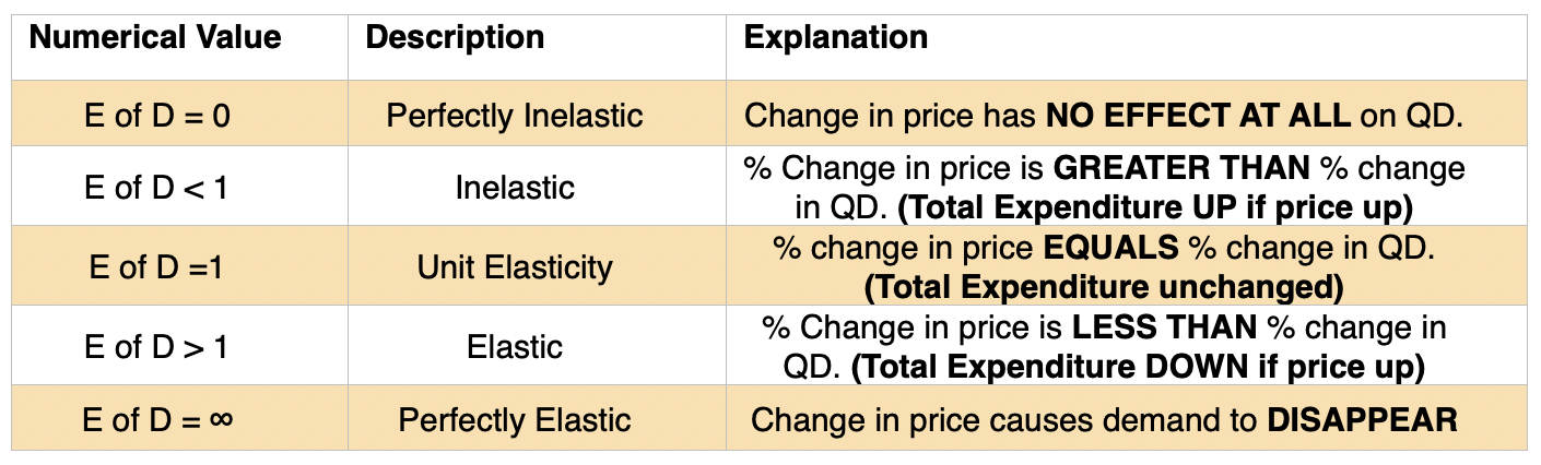
Price Elasticity of Demand (PED) This measures the relative amount by which the quantity demanded will change in response to change in the price of a particular good. The equation is:
% change in Quantity ÷ Demanded % change in Price
How is PED calculated?
Consider the following demand schedule for buses in a city centre.
Price (average fare) Quantity of passengers per week 100c 1000 60c 1300 30c 2275
Suppose the current average fare was 100c, what is the PED if fares are cut to 60c?
The percentage change in QD is equal to: • The change in demand 300 (1300-1000) divided by the original level of demand 1000. To obtain a percentage this must be multiplied by 100. The full calculation is (300 ÷ 1000) x 100 = 30%
The percentage change in price is equal to: • The change in price 40c (100c – 60c) divided by the original price 100c. To obtain a percentage this must be multiplied by 100. The full calculation is (40 ÷ 100) x 100 = 40%
These two figures can then be inserted into the formula with 30% ÷ 40% = 0.75 Let us now consider the PED when the average fare is cut from 60c to 30c
The percentage change in QD is equal to: • The change in demand 975 (2275-1300) divided by the original level of demand 1300. To obtain a percentage this must be multiplied by 100. The full calculation is (975 ÷ 1300) x 100 = 75%
The percentage change in price is equal to: • The change in price 30c (60c – 30c) divided by the original price 60c. To obtain a percentage this must be multiplied by 100. The full calculation is (30 ÷ 60) x 100 = 50%
These two figures can then be inserted into the formula with 75% ÷ 50% = 1.5
Please note that the minus sign is often omitted in PED, as the price elasticity is always negative because demand curves slope downwards. The textbook displays figures as: PED = (-) 0.2
What price elasticity of demand figures tell us.
Determinants of Elasticity of Demand
The elasticity of a product is influenced by: • the number of substitutes available • whether it could be described as a luxury or a basic commodity • the proportion of the purchaser’s income it represents • the durability of the product.
Usefulness of Price Elasticity of Demand
The usefulness of price elasticity for producers. Firms can use price elasticity of demand (PED) estimates to predict:
1. The effect of a change in price on the total revenue & expenditure on a product.
The relationship between elasticity and total revenue.
Elastic Inelastic Unitary Price ↑ TR↓ TR↑ No Change Price ↓ TR↑ TR↓ No Change
2. The likely price volatility in a market following unexpected changes in supply.
3. The effect of a change in GST (indirect tax) on price and quantity demanded and also whether the business is able to pass on some or all of the tax onto the consumer.
4. Information on the price elasticity of demand can be used by a business as part of a policy of price discrimination – off-peak and peak travel in major cities. Before 9am – inelastic demand curve – after 9am elastic demand curve.
Sign up to elearneconomics for comprehensive key notes with coloured illustrations, flash cards, written answers and multiple-choice tests on Price Elasticity of Demand that provides for users with different learning styles working at their own pace (anywhere at any time).
Climbing Ladder on a Container Ship With the downturn in global trade the international transport industry has been very much affected. Those that have been associated with the distribution of goods get an early indication of the slowdown in global growth. The obvious indicators are: idle cranes, queues of merchant ships dwindle etc. But what about the speed of cargo ships and the length of ladders to climb aboard? When the world economy was “steaming” ahead the captain of a merchant ship said that they cruised at 20 knots but in a recession we slowed to 16 knots. A harbour pilot summed up the state of world trade by the length of the ladders that he climbs on the sides of ships.
A long climb up the ladder signifies that the ship is high in the water and exports are correspondingly low. A short climb up the ladder signifies that the ship is low in the water and exports are correspondingly high.
The seafarers say that they take air to China before they load up with goods for the US.
The Number of Cranes As mentioned in my previous post, cranes are a good indicator. A tally of tower cranes can tell us about economic activity as they lift materials like concrete and steel as high as 80 stories. By counting cranes, we can get an idea of where economic activity in that area has been heading. More cranes suggest more demand for housing and offices in the market, while simultaneously signalling healthy employment within the construction sector.
The Briefcase Indicator Alan Greenspan (former US Fed Chariman) had the ‘Briefcase Indicator’. Cameras from CNBC would follow him on the mornings of Federal Open Market Committee meetings as he arrived at the Fed. The theory went that if his briefcase was thin his mind was untroubled and the economy was well. But if it was stuffed full, rumour had it that he was up all night and a rate hike was on the cards. For the record Greenspan explained in his book “The Age of Turbulence” that the size of his briefcase was solely a function of whether he packed his lunch.
More Mosquito Bites In Maricopa County, Arizona, there are a vast number of house that have been abandoned by their owners – forelosures. Within these properties are swimming pools or ponds which are now unattended. Before the financial crisis local authorities only treated 2,500 but in 2009 after the housing market collapse 4,000 were treated.
Cardboard Box Index The Cardboard Box Index offers a unique perspective on economic activity by examining the demand for cardboard boxes, a key packaging material for various products. When manufacturing and consumer spending increase, the demand for cardboard boxes rises accordingly. Conversely, a decline in cardboard box demand may signify a slowdown in manufacturing and a decrease in consumer confidence.
Sign up to elearneconomics for comprehensive key notes with coloured illustrations, flash cards, written answers and multiple-choice tests on Economic Indicators that provides for users with different learning styles working at their own pace (anywhere at any time).
The recent David McWilliams podcast entitled Humanomics discusses how economists have struggled to make accurate decisions as Ben Bernanke’s recent report on the Bank of England’s failures show. He states that economists need to get out more and uses the example of when he worked as an economist for the Irish Government. Whilst calculating the GDP forecast for the Irish economy using all sorts of formulae a senior economist told him to look out the window at the number of cranes in the skyline as that will give you an idea of what is going on in the economy. He compares the beauty of the exactness of the formula against the truth of what is really happening in the economy.
A blind faith in mathematical precision has clouded our judgment. Humans are messy and economics is about humans, so let’s be messy.
In 1776 Scottish economist Adam Smith talked of the economy as the invisible hand. Here he emphasized the self-regulating nature of the economy as individuals, firms and companies independently seek to maximize their gain which may produce the best outcome for society as a whole. The capitalist systems seems to rely more on the relentless growth of consumer spending and, although it can lead to dramatic improvements in standard of living, it does require people to become resolutely addicted to products/services and be prepared to get into significant debt.
Today, an economy is a much more intricate machine which aims to allocate scarce resources to satisfy the utility of economic agents such as individuals, firms and government. The dominant model for many years has been “Dynamic Stochastic General Equilibrium” (DSGE) and it takes all the characteristics of an individual (this person is typically called the representative agent) which is then cloned and taken to represent the typical person in an economy.
Therefore it assumes that all individuals and firms have identical needs and wants which they pursue with total self-interest and complete knowledge of what they desire. DSGE also takes into account the impact of shocks like oil prices, technological change, interest rates, taxation etc. However a couple of areas that it doesn’t represent accurately is the financial sector and the instability of markets – booms and slumps. A new task will be to include the banking sector into the models as macroeconomists assumed it to be a screen between savers and borrowers rather than profit orientated organisations prepared to take big risks with increased leverage and sub-prime lending. For example as house prices increase banks are willing to lend more money to speculators who bid up the price above what is the fundamental value. The opposite applies if banks become more risk adverse and marginal buyers are forced out of the market causing prices to drop. By representing the financial sector in an economic model you go some way to help solve the major problem with DSGE and other models in that they are useful only if they are not unsettled by external factors like a banking crisis.
Keynes said “If economists could manage to get themselves thought of as humble, competent people, on a level with dentists, that would be splendid!”. To achieve this there needs to be structural reform in the discipline.
Agent-based modeling
An emerging field called agent-based modelling has grabbed the attention of some economists. This is where large amounts of data is collected from individuals who are unique to each other in they have different motives and actions in the market place. The behaviour of these individuals overlap and interact which generate predictions through a messy process but similar to what happens in real life, unlike DSGE and the clean old-fashioned macroeconomic models. Agent-based modeling has also shown promise in other disciplines like Physics and involve real-world problems. The example used by John Lanchester (New York Times magazine) is how Brazil nuts seem to end up towards the top of the mixed-nut package and nut research has since found real-life applications in industries such as pharmaceuticals and manufacturing.
With a better sense of what is influencing behaviour in the economy, economists might become less blinkered by their own theory, and better able to foresee the next crisis. Meanwhile, they would be wise to repeat (daily) the words: “My model is a model, not the model.”
Final thought
Macroeconomic models need to be adapted to take account of the events of the last 20 years. For so long typical macro model has been DSGE but as yet no model includes the impact of recessions and the eighty-year depressions. Economics failed to predict or prevent the GFC and this was based on conceptual faults which included a refusal to engage with the role of the banking and finance system in the economy.
Dani Rodrik of Harvard University splits economists into two camps: hedgehogs and foxes.
Hedgehogs take a single idea and apply it to every problem they come across.
Foxes have no grand vision but lots of seemingly contradictory views, as they tailor their conclusions to the situation.
Sign up to elearneconomics for comprehensive key notes with coloured illustrations, flash cards, written answers and multiple-choice tests on Macro Economics that provides for users with different learning styles working at their own pace (anywhere at any time).
A lot has been said about the impact of AI and its ability to transform an economy although it does not have a predetermined future. The IMF publication F&D (December 2023) ran article on the implications of AI on macroeconomics – two areas of focus were productivity and inequality.
Productivity
Low productivity: adoption by business maybe slow and confined to large firms. Narrow labour-saving technology such as automated checkouts in supermarkets. Workers might end up doing less productive and dynamic jobs. Benefits of AI might not show up in the data decades later.
Robert Solow talked about the impact of computers in 1987 – ‘You can see the computer age everywhere but the statistics’.
Companies may not be able to figure out how best to use AI in an organisational sense. Also a lot of uncertainty over what current laws concerning intellectual property mean when considering that it might include the protected intellectual property of others. Furthermore, governments might impose strict regulations with the uncertainty around AI especially with the impact on the labour market.
High productivity:AI could be a massive boost to productivity by complementing workers and freeing them up to be more inventive in their tasks. AI can capture the tacit knowledge of individuals and organisations by drawing on vast amounts of newly digitised data. An AI enables society not just to do better the things it already does but to do things and envision things previously unimaginable.
Income Inequality
Low inequality:AI could lead to lower income inequality because its main impact on the workforce is to help the least experienced or least knowledgeable workers be better at their jobs. A study of 5,000 workers who do complex customer assistance jobs at a call centre found that among workers who were given the support of an AI assistant, the least skilled or newest workers showed the greatest productivity gains. If AI is a substitute for the most routine and formulaic kinds of tasks, then by taking tedious routine work off human hands, AI may complement genuinely creative and interesting tasks, improving the basic psychological experience of work, as well as the quality of output.
High inequality: AI could lead to higher income inequality. Technologists and managers design and implement AI to substitute directly for many kinds of human labour, driving down the wages of many workers. If AI substitutes higher paying jobs, more workers are relegated to low-paying service jobs where some human interaction is valued and the pay is low. In this scenario it could be that businesses cannot justify the cost of a big technological investment to replace them and income inequality increases.
Sign up to elearneconomics for comprehensive key notes with coloured illustrations, flash cards, written answers and multiple-choice tests on Productivity and Inequality that provides for users with different learning styles working at their own pace (anywhere at any time).
With exams approaching in the northern hemisphere thought this post might be useful. There are concerns about essay writing in that students tend to either write sentences that are too long, or they do not know how to write different types of sentences. Better essay writers vary the style of sentence they use to keep the reader interested. Sentences of 20 words or less will make it easier for the marker to grasp the point you are trying to get across. Below are some ideas that may be useful to add some spice to student essays. Source: Dr Ian Hunter – ‘Write That Essay! A Practical Guide to Writing Better Essays and Achieving Higher Grades’
Source: The New Yorker
The very short sentence Five or six words Can break up longer flow Statement that the reader will not miss Immediate impact Used extensively in the media to grab attention Economy in recession as inflation soars
Repeating Pattern Easy to use but don’t overplay Pick a sentence and use it as a motif Can be a single word or phrase Without doubt the most vibrant economy was China, and its most vibrant export was the Apple iPhone
Adverb at the front Alters a plain sentence Accentuates a particular point Grab an adverb to introduce a sentence Interestingly, the US debt ceiling debate didn’t have an adverse impact on the economy.
The Em Dash Purpose is to isolate a part of a sentence Phrase is oblique to content of that sentence The New York Stock Exchange – the biggest financial market – recovered after the GFC due to the government stimulus.
The ‘W’ Start Easy to use Adds interest to the flow of an argument What caused the depreciation of the NZ dollar is debatable.
The Paired-Double Get rid of ‘ands’ Use a semi-colon for two sentences Unemployment was at 10%; structural issues were seen as the main cause.
Prepositional Phrases Word which modifies a phrase Classic examples are by, with, from From the outset, it was clear that the Reserve Bank was not going to reduce the Official Cash Rate.
Verb At The Start Adds interest to your writing Two forms of verbs work well: either an -ed form of the verb, or an -ing form of the verb. Determined to help developing countries, the World Bank provides technical and financial support in implementing reforms.
Alliteration Repeating words can draw attention Should not be overused Government policy during COVID was expansive, extensive, and expensive.
Metaphor And Simile Metaphors add drama and emphasis Simile is good at explaining difficult concepts With the war in the Ukraine and a cost of living crisis, red warning lights are once again flashing on the dashboard of the global economy.
Colon: And Flow Point just made is to be expanded upon Can be used to convey several points or expand on a keyword, the final word. There were three options for the government to reduce climate change: firstly, tax polluters; secondly, import carbon credits; thirdly, plant trees.
Good Ol’ Red, White, And Blue Use of a comma to separate the three terms accurately. Two commas should be used if all three items have equal merit. The 2008 financial crisis was about credit default swaps, sub-prime mortgages, and the regulator asleep at the wheel.
With the exam season approaching in the northern hemisphere here is something on the kinked demand curve. In 1939 Paul Sweezy of Harvard University wrote his paper ‘Demand Under Conditions of Oligopoly’ in which he explained conditions around the kinked demand curve. He suggest that rivals in a market react differently according to whether a price change is upward or downward.
If producer A raises his price, his rival producer B will acquire new customers. However if producer A lowers his price, his rival producer B will lose new customers. From the point of view of any particular producer this means simply that if he raises his price he must expect to lose business to his rivals (his demand curve tens to be elastic going up), while if he cuts price he has no means to believe he will succeed in taking business away from his rivals (his demand curve tends to be inelastic going down). In other words, the imagined demand curve has a “corner’ at the current price.
MR curve at 0 output An important point to note with a kinked demand curve is that as revenue falls if the price increases or decreases the MR curve must cut the horizontal axis at this output. Therefore, as well as being where MC=MR profit maximisation output it is also revenue maximisation. If a seller reduces the price of the product below P1, his rivals will also reduce their prices. Though he will increase his sales, his revenue would be less than before. The reason is that the AR portion of the kinked demand curve below P is inelastic and the corresponding part of marginal revenue curve after Q1 is negative. Thus in both the price-raising and price-reducing situations, the seller will be a loser. He would stick to the prevailing market price P1 which remains rigid.
A lot of textbooks draw the second part of the MR above the horizontal axis which indicates that total revenue is still increasing. Below is a useful mindmap on the topic
For more on the Kinked Demand Curve view the key notes (accompanied by fully coloured diagrams/models) on elearneconomics that will assist students to understand concepts and terms for external examinations, assignments or topic tests.
Post COVID-19 has seen the rapid rise in prices globally which in turn has led central banks implementing a tight monetary policy (higher interest rates) to counter this rise in inflation. The impact on consumers of higher interests depends in their current financial situation. In most economies a mortgage is the largest liability that consumers have and the property market is a large part of the economy. Mortgages can be fixed or floating and research from the IMF show that fixed-rate mortgages have become more common globally – see image. Fixed-rate mortgages vary – close to zero in South Africa to more than 95 percent in Mexico or the United States.
Those on floating rates = payments rise with higher interest rates so monetary policy is more effective
Those on fixed rates = payments stay the same for the duration of the fixed term so monetary policy is less effective
The effects are greater where mortgages are larger compared to home values and in countries where household debt to GDP is high. Therefore consumers are more exposed to changes in interest rates. Nevertheless there will be a time when fixed mortgages reset and you could see a big drop in consumption and a more effective monetary policy. The timing of the reset is crucial as the new rate will most likely be linked to the central bank rate at the time, with the latter being indicative of inflationary conditions. See monetary policy transmission mechanism below.
Countries mortgage markets vary – where there is a declining share of fixed mortgage rates, greater debt and limited housing supply monetary policy is more effective as higher interest rates cut into consumers disposable income e.g. Canada and Japan. Monetary policy seems to have weakened in its impact in countries such as Hungary, Ireland, Portugal and the US where the reverse applies in some areas.
John Mauldin’s book “End Game: The End of the Debt Supercycle and How it Changes Everything” and his weekly publication ‘Thoughts from the Frontline’ address the topic of debt and in particular when debt-fuelled asset price explosions seem to be to good to be true, they probably are. Debt is useful if you can pay back the borrowed money and from it are able to generate value in an economy. This ultimately raises living standards and economic growth. However throughout history debt has been misused by both the private sector and government. This area has also been studied by Ken Rogoff and Carmen Reinhart in their book “This time is different” – see previous blog posts. Historically there has been the temptation of governments and companies to keep borrowing even during a bubble. But highly leveraged economies, particularly those in which continual rollover of short-term debt is sustained only by confidence in relatively illiquid assets, seldom survive forever, particularly if leverage continued to grow unchecked. Failure to recognise the unpredictable nature of confidence especially when you are rolling over short-term debt can lead to a collapse of confidence and fewer lenders
How the debt cycle works. Central banks manipulate interest rates and credit conditions to encourage more spending. If this spending is not controlled it may lead to inflation (most central banks target 2%) forcing the bank to tighten monetary policy – higher interest rates. This may lead to some debt being liquidated but some debt remains and is carried over to the next economic cycle. In the forthcoming cycle the same happens again and you get more unliquidated debt which is added to that of the previous cycle and so on. As the debt load increases a country’s ability to stimulate growth falls and more debt is required to produce the same amount of growth – see image below.
In 2022, global public debt – comprising general government domestic and external debt – reached a record USD 92 trillion. Developing countries owe almost 30% of the total, of which roughly 70% is attributable to China, India and Brazil. China’s current problems can be traced back to its massive post-2008 investment stimulus, a significant portion of which fueled the real-estate construction boom. After years of building housing and offices at breakneck speed, the bloated property sector – which accounts for 23% of the country’s GDP (26% counting imports) – is now yielding diminishing returns. This comes as little surprise, as China’s housing stock and infrastructure rival that of many advanced economies while its per capita income remains comparatively low.
Sources: ‘Thoughts from the Frontline’ John Maulden This Time Is Different: Eight Centuries of Financial Folly. Ken Rogoff & Carmen Reinhart
For more on Economics view the key notes (accompanied by fully coloured diagrams/models) on elearneconomics that will assist students to understand concepts and terms for external examinations, assignments or topic tests.
Higher incomes may make life easier with an ability to afford certain items whether it be a new car or household appliance but this is only one variable in predicting happiness. Other variables, such as social support, life expectancy, freedom, generosity, and the absence of corruption, also help explain varying levels of happiness between countries. The Easterlin Paradox In the mid 1970s Richard Easterlin drew attention to studies that showed that, although successive generations are usually more affluent that their parents or grandparents, people seemed to be no happier with their lives. It is an interesting paradox to study when you are writing about measuring economic welfare and the standard of living.
The World Happiness Report for 2023 advocated policies that not only foster economic growth but enhance the quality of life. Governments can adopt a more holistic approach to policy-making, ensuring that progress is measured not solely by material wealth but by the well-being of their citizens. While higher GDP per capita goes together with higher life satisfaction, there are other factors that help explain the striking differences between some examples – see image below from the IMF.
Source: F&D March 2024 – IMF
Sign up to elearneconomics for comprehensive key notes with coloured illustrations, flash cards, written answers and multiple-choice tests on GDP and its limitations that provides for users with different learning styles working at their own pace (anywhere at any time).
The robusta coffee bean is widely used in espresso blends as it is widely accepted that it produces a better creamy layer found on the top of a shot than arabica. However over the last year prices have reached their highest level for 29 years – 186.36 US cents/lb in March 2024. The cause of this increase is basic supply and demand
If we look at actual coffee prices in New Zealand the average price of a takeaway coffee around the country has risen to $4.74. That’s 64% higher than it was back in 2007 (which is the earliest we have nationwide data). As a comparison, consumer prices more generally rose by just over 50% over the same period. The cost of beans (arabica beans) has risen around 67%, milk prices are up 50% and the cost of labour in the hospitality sector has basically doubled. See graph below:
Sign up to elearneconomics for comprehensive key notes with coloured illustrations, flash cards, written answers and multiple-choice tests on Supply & Demand that provides for users with different learning styles working at their own pace (anywhere at any time).